Cart
You have no items in your shopping cart
The Blue Planet Fish Logo Background
The evolution of the “Cromag Fish” logo, in memory of Brian Kim
We often get asked about the story behind the Blue Planet logo so I would like to share its history with you.
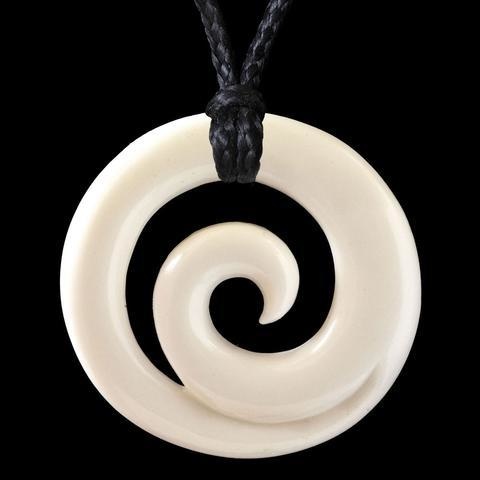
When I first started the business in 1992 as a project for the University of Hawaii Business College classes I was taking, I made some business cards using a logo with a wave inside a circle that I had hand sketched. This logo was inspired by Maori artwork I had seen on a trip to New Zealand.
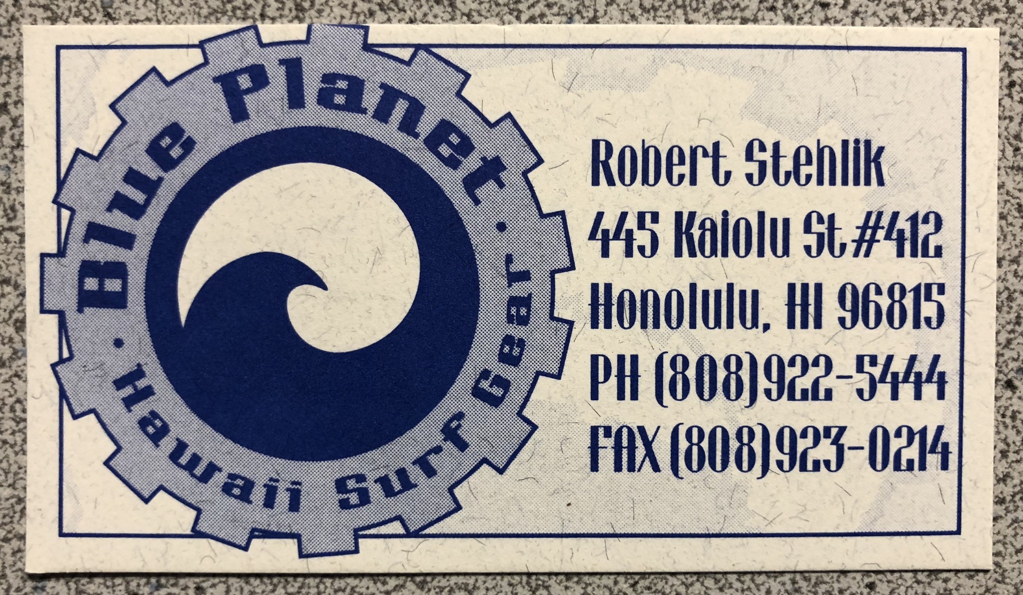
I liked the simplicity of it but people said it looked a bit generic and there were several other companies out there with similar logos.
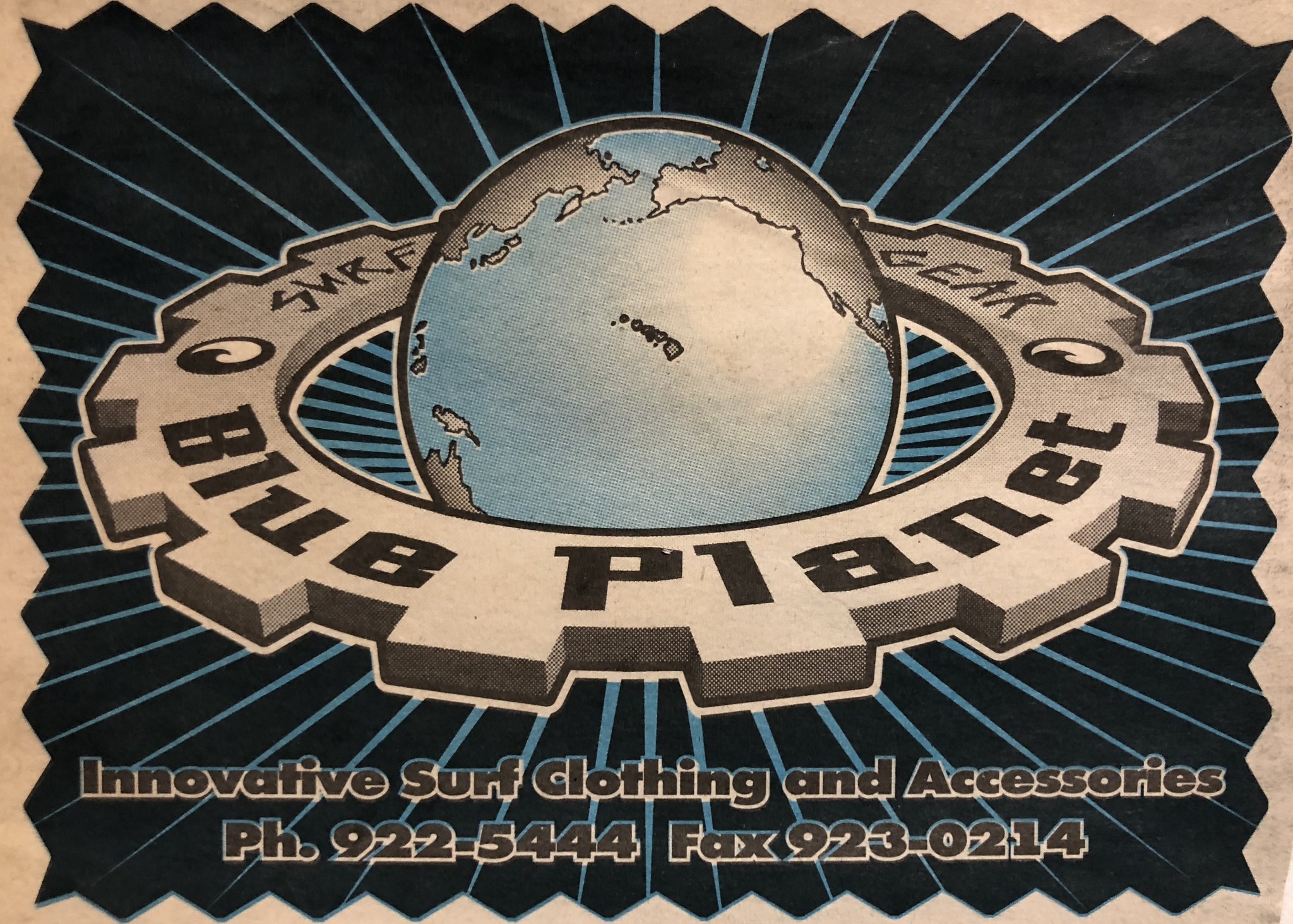
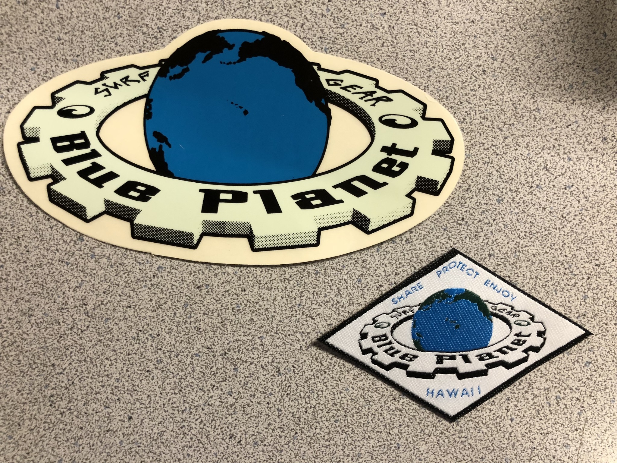
We soon developed a new logo with the Blue Planet in the middle and a 3D Gear around it. We registered our first US trademark with this “Globe and Gear” logo. We still use the Globe logo on some of our clothing labels today.
A close friend, Brian Kim made some sketches with T-shirt ideas for our young company, including this one:
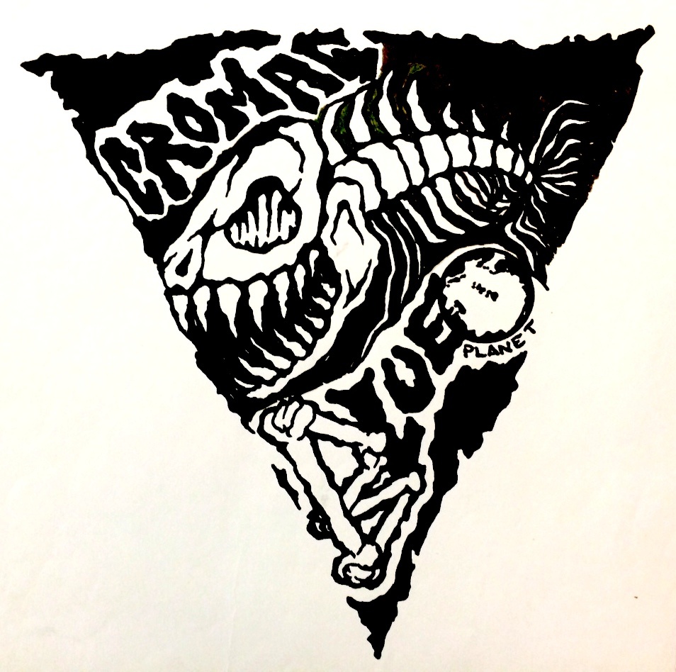
Blue Planet Cromag Fish logo
I really liked the fish and asked him how he came up with it. He said he was inspired by the Jurassic Park movie logo which came out in 1993, the year Blue Planet was officially registered as a business. He thought it would be cool to use a T-Rex type head and give it a fish body. Why the Cromag and bones in the drawing? He derived it from Cro-Magnon, the name given to some of the first early modern human (homo sapiens) skeletal remains found.
I thought the fish was really creative and funky, so he came up with some more versions of crazy looking fish, including these:
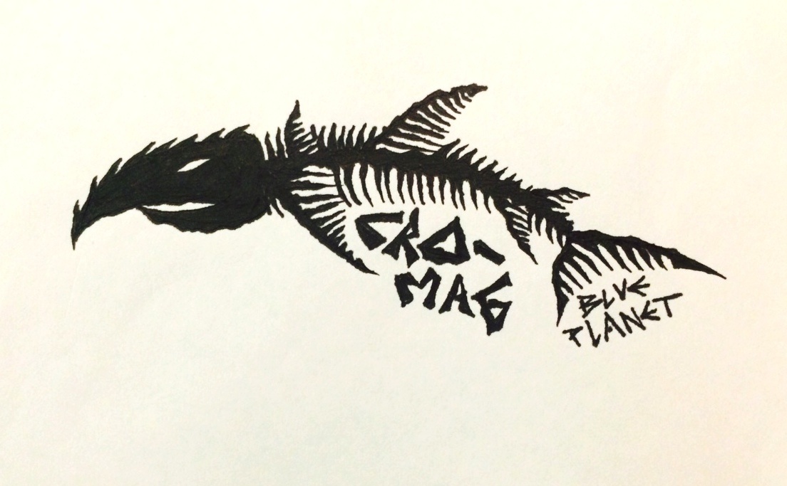
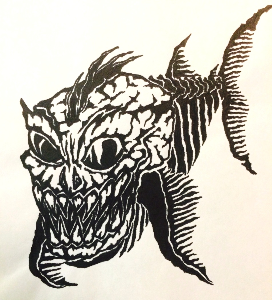
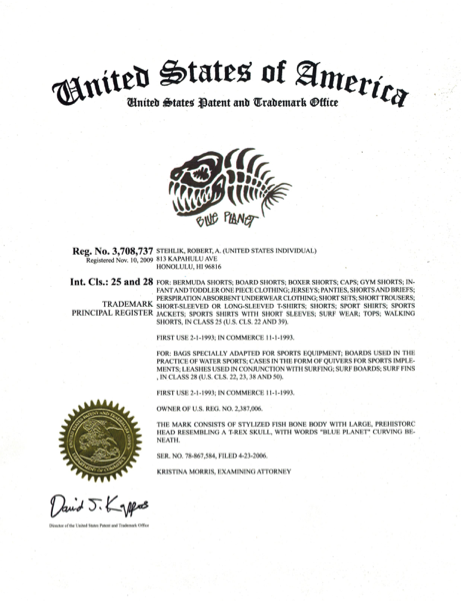
I still liked Brian’s original fish drawing the best and wanted to simplify it, so I hand sketched different versions of the fish body. As I was revising the sketches, I thought that it represented our young surf company in many ways. We loved the ocean and every surfer sometimes feels like a “fish out of water”. The fish seems to be smiling and jokingly reminds that we need to take care of our Blue Planet or we will become as extinct as this crazy creature. We named it “Cromag Fish” based on Brian’s artwork and we printed it on T-shirts. The Cromag Fish quickly became our best selling design and it developed somewhat of a cult following on Oahu. Customers were coming to us showing off their Cromag Fish tattoos and people were saying “Oh yeah, Blue Planet, you guys have that crazy fish logo”. The fish obviously caught people’s attention and is what people remembered us by. I also felt that it is a good reminder that as a small business with much bigger competitors, we had to be aggressive to survive in a “fish-eat-fish” world. So we made the decision to use it as our main business logo, we used this version of it in our 2008 US trademark application.
Around 2009, my stepson Joe Giletti, a talented graphic artist, was doodling and made a sketch using the Hawaiian Island Chain as the spine of the fish. I really liked how the Hawaiian Islands represented our roots and the inspiration behind the business. The rasta colors made the islands pop out and that’s how we ended up with the logo we use today, the rasta-island-bones-cromag logo:
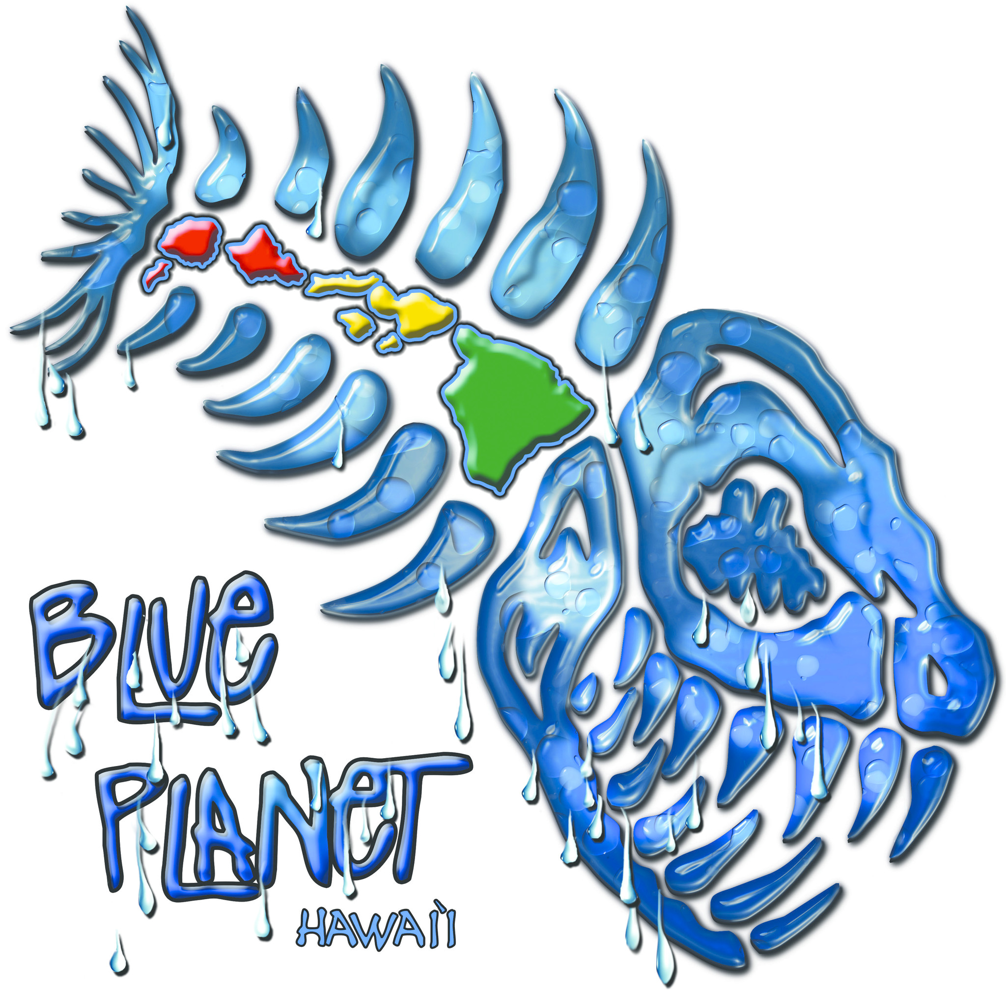
So, our fish logo is somewhat of a Frankenstein creature with several mad scientists contributing parts over the years, who knows how it may evolve in the future!
Aloha,
Robert Stehlik
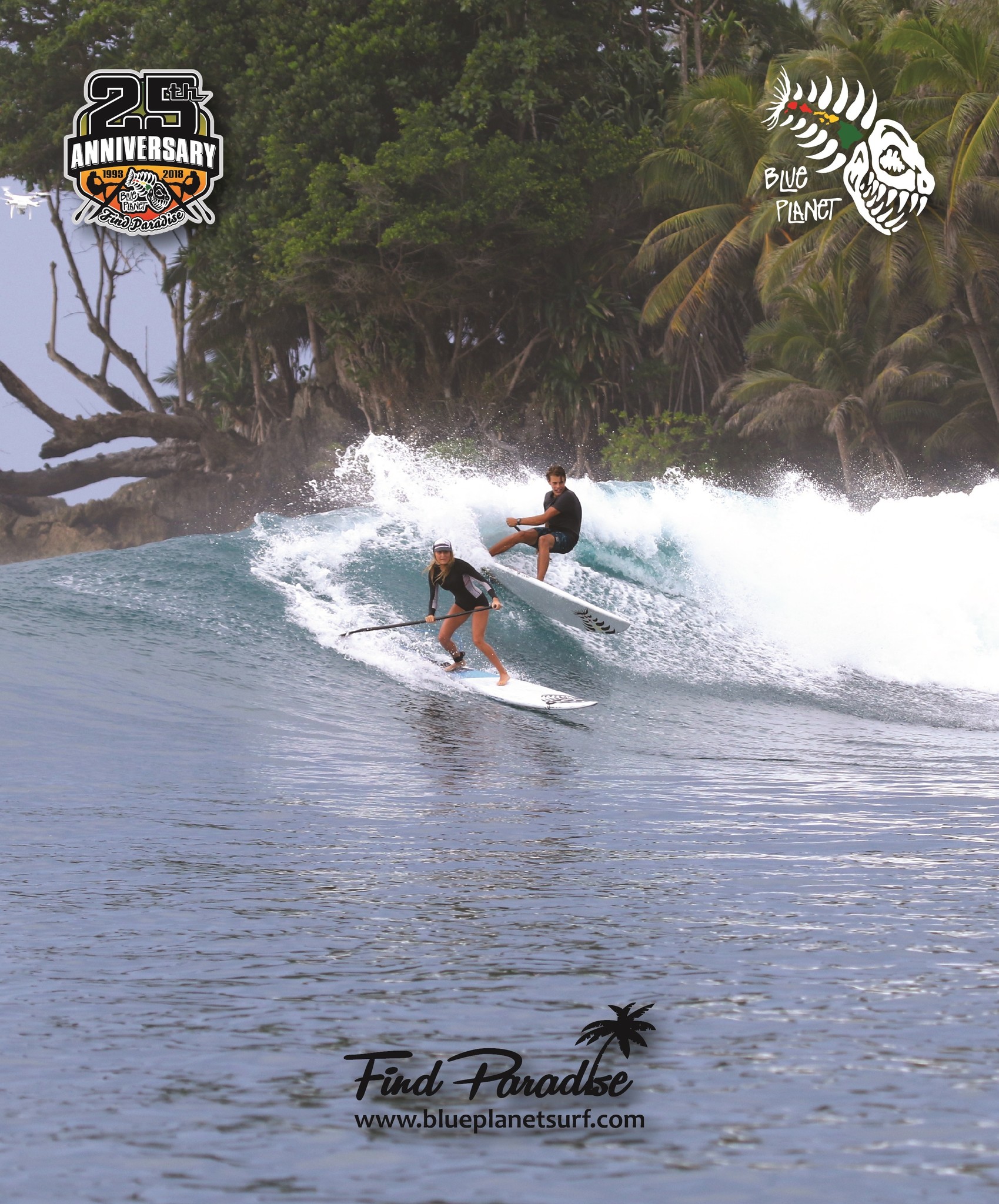
P.S. Come by our shop to pick up this free poster celebrating our 25th Anniversary:
Comments
Be the first to comment...